Cody Heat Map
In honor of my insomnia, and the second week of optimization month (which highlights effective ad placement, among other things), I will show a heat map of optimal Cody placement on a bed (to maximize human and canine sleep). Unfortunately, we are currently not well optimized and although canine sleep does not appear to suffer, human sleep has.
Let's start with the originally planned, optimal bed configuration:

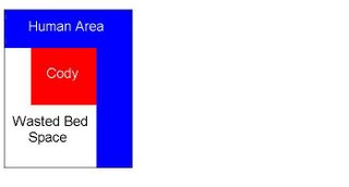
In heat map colors, this would be the representation of the ideal configuration where Cody is in red. The worst place for Cody to be (where the human area is) is in blue.

After a few weeks, this was how the bed looked. I would say this is the worst possible configuration as it wastes the most available area (bed space).

And now, this is the compromise. A bit better than the last scenario, but still a long way from ideal. As this is optimization month, I will also try to optimize my sleep my trying to reinstate the original, ideal configuration.

By the way, this is also appropriate to mention that without testing these configurations, I would not know beyond a doubt that the original configuration was the most ideal. This is why A/B Testing is always a good idea. You never know if you are using the most optimal placement until you try. (This is my belated tribute to last week's optimization week theme of testing and tracking optimization effectively. I have been very bad in that I have not actually tracked the number of hours slept for human and canine during these tests. Since there are multiple external variables, it would be difficult to attribute the factors accurately)
In honor of my insomnia, and the second week of optimization month (which highlights effective ad placement, among other things), I will show a heat map of optimal Cody placement on a bed (to maximize human and canine sleep). Unfortunately, we are currently not well optimized and although canine sleep does not appear to suffer, human sleep has.
Let's start with the originally planned, optimal bed configuration:

In heat map colors, this would be the representation of the ideal configuration where Cody is in red. The worst place for Cody to be (where the human area is) is in blue.

After a few weeks, this was how the bed looked. I would say this is the worst possible configuration as it wastes the most available area (bed space).

And now, this is the compromise. A bit better than the last scenario, but still a long way from ideal. As this is optimization month, I will also try to optimize my sleep my trying to reinstate the original, ideal configuration.

By the way, this is also appropriate to mention that without testing these configurations, I would not know beyond a doubt that the original configuration was the most ideal. This is why A/B Testing is always a good idea. You never know if you are using the most optimal placement until you try. (This is my belated tribute to last week's optimization week theme of testing and tracking optimization effectively. I have been very bad in that I have not actually tracked the number of hours slept for human and canine during these tests. Since there are multiple external variables, it would be difficult to attribute the factors accurately)

0 Comments:
Post a Comment
<< Home